Python 實現桑基圖(Sankey)
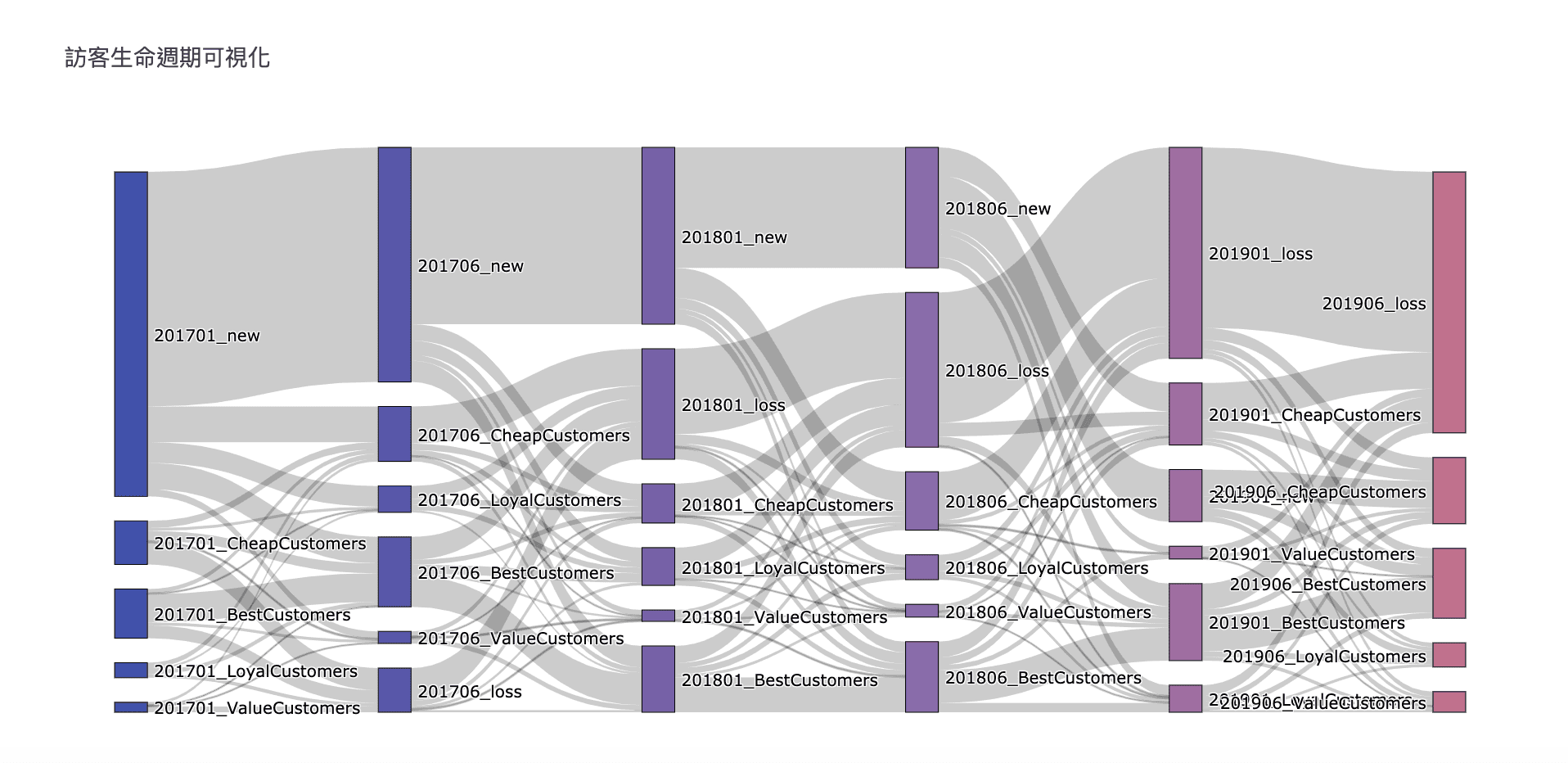
透過上次 RFM 用戶分析模型將訪客分群,用 Python繪出桑基圖(Sankey)將用戶不同時間點分群的變化,用來觀察整體訪客經營是否符合預期中的變化。
桑基圖 (Sankey Diagram)
桑基圖是一種流程圖,其資訊包含著流量的大小、方向及變化狀況,套用在不同階段的客戶分群上,可以簡單看出訪客的變化狀況。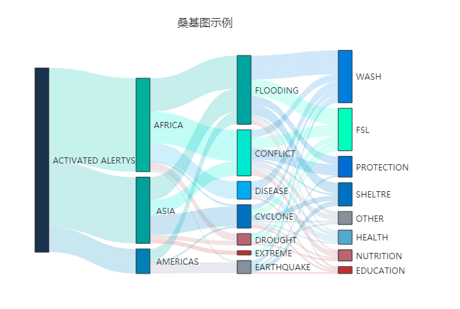
客戶分群意義
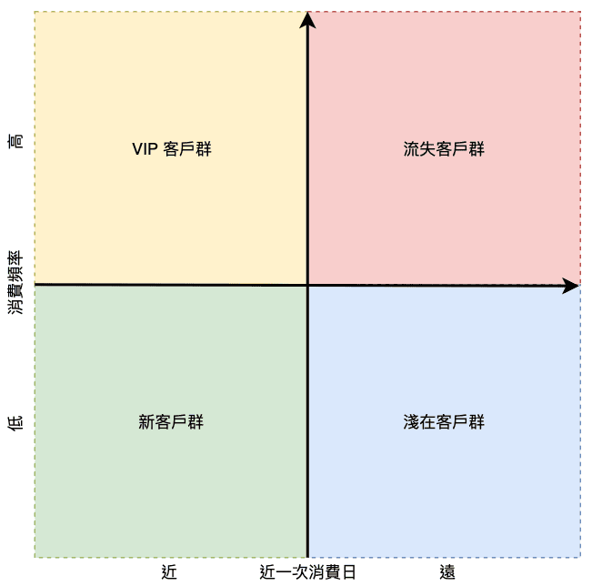
接續 RFM 用戶分析模型的分組,避免維度太多只使用 Frequency 與 Monetary 分成 4 組。
| Frequency 頻率 | Monetary 金額 | 客戶分群 |
|---|---|---|
| 高 | 高 | Best Customers |
| 高 | 低 | Value Customers |
| 低 | 高 | Loyal Customers |
| 低 | 低 | Cheap Customers |
實作
分群步驟參照前一篇 RFM 用戶分析模型。
資料準備
Sankey 圖基本上由 source, target, value 組成,其資訊包含著流動方向與流量值。下圖為這次準備的數據集,其包含客戶每半年的分群與數量。

繪圖
函數
1 | def gen_sankey(df, cat_cols=[], value_cols='', title='Sankey Diagram'): |
函式使用
1 | import plotly |
本部落格所有文章除特別聲明外,均採用CC BY-NC-SA 4.0 授權協議。轉載請註明來源 隨勛所欲!
相關推薦

2020-06-17
Python networkx 筆記
本文介紹 NetworkX 函式庫的基本使用方法,包含如何建立網路圖、添加節點和邊、設置權重,以及使用不同的佈局方式進行視覺化。適合需要進行網路分析和圖形視覺化的開發者參考。
2019-11-29
Python 實現 RFM 用戶分析模型
本文介紹如何使用 Python 實現 RFM 客戶價值分析模型,透過近期購買行為、購買頻率、購買花費三項指標來評估客戶價值。包含完整的程式碼實作與視覺化分析。

2020-03-31
Python 多執行緒 (multiprocessing)
Python multiprocessing 筆記
2019-12-16
Python:Google Analytics Reporting API 快速入門
本文教 Analytics Reporting API v4 的 Python 快速指南,使用服務帳戶(Service application)取得報表資料,大部分都是程式碼,說明較少。

2020-09-01
Python-推薦系統社群網路
本文介紹如何利用網站流量數據建立推薦系統,透過分析同一 Session 中被瀏覽的文章關係,結合 Louvain 社群發現算法進行文章分類。包含完整的程式碼實作與視覺化分析。

2020-05-28
Python getopt 命令列參數
Python 提供 `getopt` 模組,提供幫助解析命令列的選項和參數。另外可以透過 `sys.argv` 取得命令列任何參數。
評論